Area Code 626 Exhibit Design
Title:
Area Code 626 Exhibit
Brief/Context:
This was an 8-week project from my exhibition design class where we were asked to curate and design an exhibit based on the location of where we live. I chose to do the 626 area code/San Gabriel Valley where I grew up. The 626 area is one of the largest Asian hubs in America and I was interested in how that came to be. After doing some research, I found that there was a lot more history surrounding the area than I previously thought and structured my exhibit around each period of history.
Tools:
Model Building Materials, Vectorworks, Twinmotion, Illustrator
Process:
The process for this project was divided into four sections: exhibition theme and object curation, floor plan/model building, material plan and 3D renderings, and marketing/graphic identity.
Part One: Exhibition Theme and Object Curation
For this section, I first did a lot of background research on the area before deciding how to break up the exhibit. I decided to split the exhibit into five sections (as listed below). After, I found different artifacts and photographs that could be used to inform visitors of the history.
Exhibition Theme
Object List
Part Two: Floor Plan and Scale Model
I started this section by creating a rough floor plan to help with object placement and general layout. Once I had that finished, I created a scale model and placed my objects within the space to see if I liked the layout once it was in a 3D form.
Floor Plan
Scale Model
Part Three: Material Planning and 3D Renderings
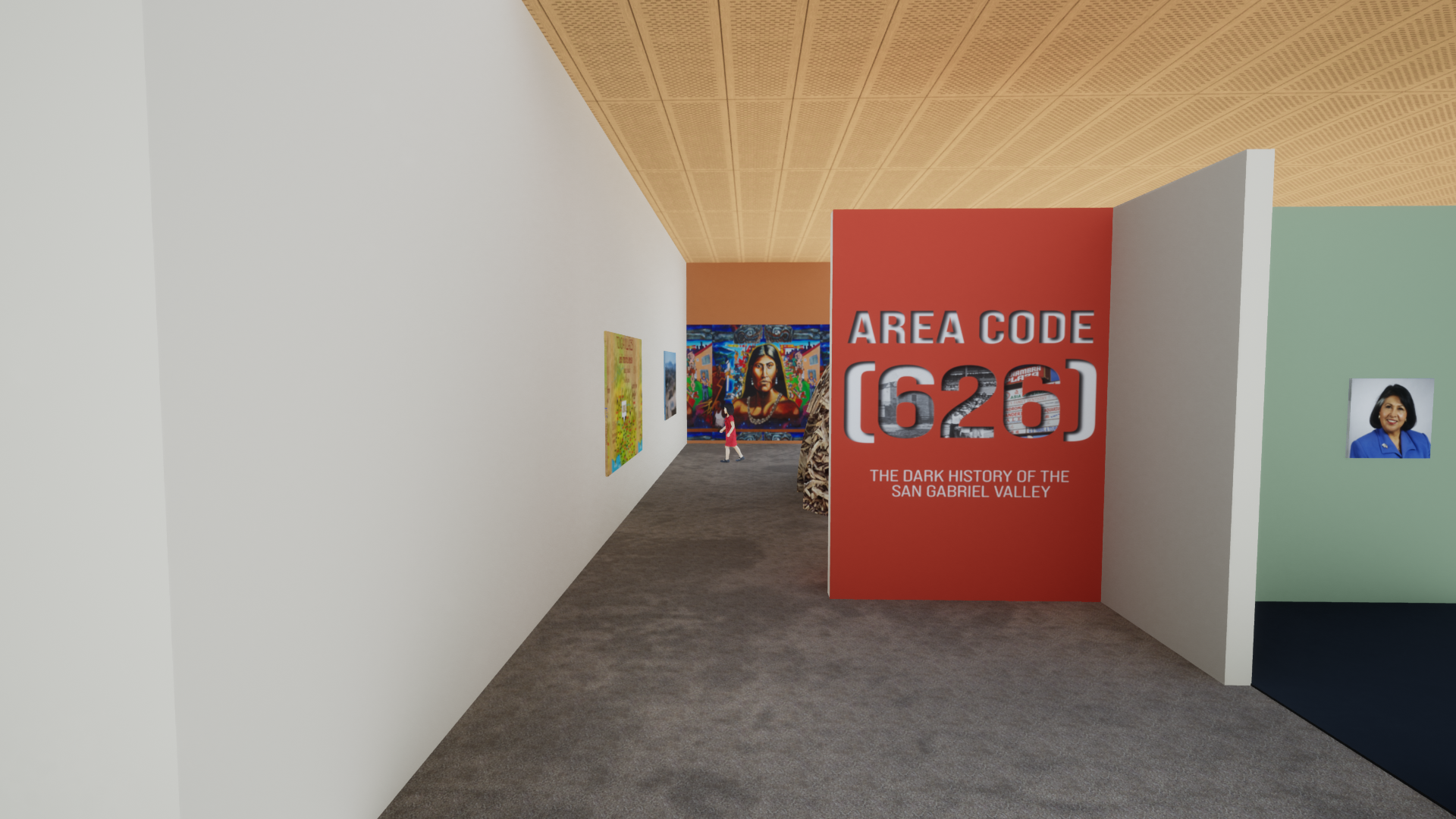
In this phase, I took my plan and made a digital version of the exhibit on Vectorworks and Twinmotion in order to create views of what I wanted the exhibit to look like. I also chose color scheme and material palette that would be used inside.
Material Planning
3D Renderings
Part Four: Marketing and Graphic Identity
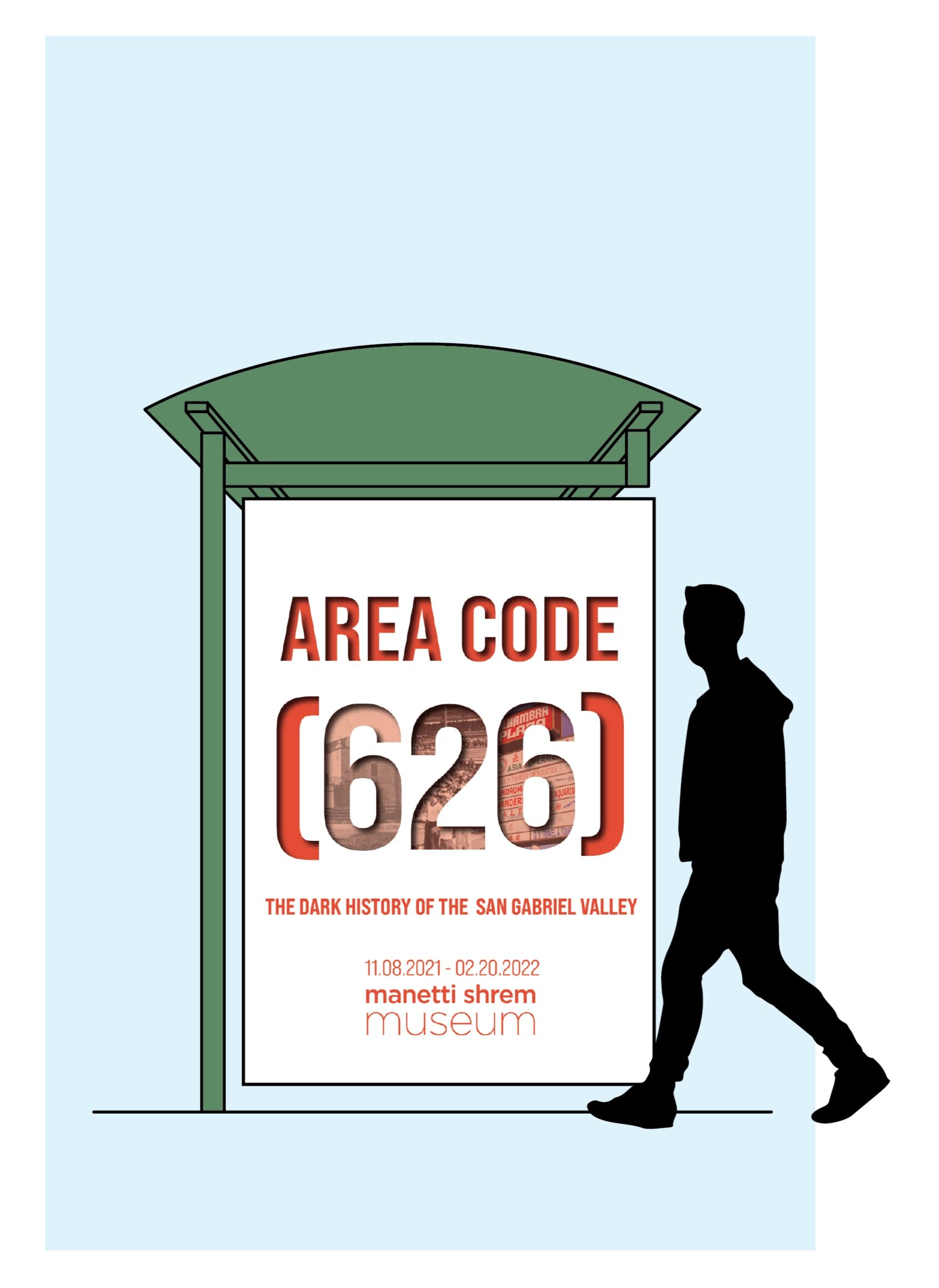
The goal of this section was to create a graphic identity that aligns with the exhibit, is memorable to the public, and legible. I decided to use the same color palette as the exhibit to keep the design cohesive and created advertisement material that was bold and focused on different objects throughout the history of the area.
Title Wall
Advertisement Material


